Hang Ten has a new identity today: a new wordmark, a new palette, a new typeface and a rebuilt website. Our teams made it together, a five-month-old company and a creative consultancy, in five weeks of design and two weeks of implementation. We did it using the new way of work in the era of AI. This is an account of how we worked.
An AI-native timeline
An identity project of this kind can run eight to ten+ weeks. We gave ourselves five.
Hang Ten launched in June with a website and communications built quickly by a single employee using AI, and its name set in a standard flared serif font. Since then the company has raised $85M and signed customers among the largest companies in the world. It needed an identity that matched, and it needed it at the speed the company itself moves.
The timeline shaped how we worked. We removed the usual layers between the people deciding and the people designing. Hang Ten's leadership shaped the work directly, and there were very few status meetings. When we met, it was to make a creative decision, and the feedback was specific: on engineering, on proportion, on motion, on how the system would work with AI tools. This close collaboration helped us move quickly while giving the creative work the attention it deserved.
| Aspect | A more traditional approach | How we worked |
|---|---|---|
| Timeline | Typically 8-10+ weeks1 | 5 weeks |
| Decisions | Multiple approval layers | Senior leadership shaping the work directly |
| AI | A productivity add-on | A tool in the creative process, and autonomous agent during implementation. |
| Handover | Brand guidelines and assets | An AI-ready design system, including design.md |
| Implementation | Agency-led production | Internal ownership and execution, with specialist creative support at high impact moments |
1 Timelines are indicative and vary by scope and complexity.
Who it had to speak to
We started with three audiences. Business and technology leaders look for confidence, credibility and evidence of delivery. Engineers, technologists and scientists value rigor, precision and things that work beautifully. And exceptional candidates are drawn to ambitious work, experienced teams and the chance to make a real difference.
One identity had to hold all three audiences. It had to carry decades of enterprise experience of the team, together with the energy of a startup.
Structure and Beauty, a creative tension
The idea that organized everything came early, from a key idea we expressed as follows: "The engineering mindset is one which mixes structure and discipline with beauty. It's about attention to detail, but it's also about inherent beauty in the craft."
We put the brand at the meeting point of those two words. Structure means clear systems, deliberate choices, precision and purpose. Beauty means harmony, warmth, character and imagination. Structure gives the brand its discipline. Beauty gives it life.
The two pull against each other, and that was the useful part. The greater the tension, the higher you can jump on the creative trampoline. Too little tension, you land flat. Too much tension and it rips apart, you can’t jump at all. Every decision was argued from both sides. When something felt too engineered we asked where the warmth was. When something felt too ornamental, we asked what rule it followed.
Where the jump shows
The wordmark. We began here. The letterforms are geometric and carefully balanced, and two details give the mark its signature: a small square beside the T, echoed by a square of negative space cut into the H. The H itself echoes a sideways T within it, and works as a standalone totem. The lettering was refined with the type foundry Dalton Maag until form and proportion sat right.
The square. That square became the motif for everything else, a more elegant version of the pixel. Repeated, scaled and rearranged, it builds the graphic textures and the illustrations and ties each of them back to the wordmark.
Type. The system uses a serif and a sans from one family. The sans brings order and precision to technical information. The serif is more human and carries the headlines. They share an underlying structure, so the two can trade roles and still read as one voice.
Color. A bright yellow-green gives the brand a confident accent, a familiar highlight color in engineering documents, balanced by natural tones loosely inspired by sea and sand. We kept the references to surfing and "hanging ten" subtle on purpose. The palette has warmth and range without leaning on the name. We added a subtle orange highlight at the request of Vishal, Co-founder and CEO, to denote the beauty of a sunrise over water.
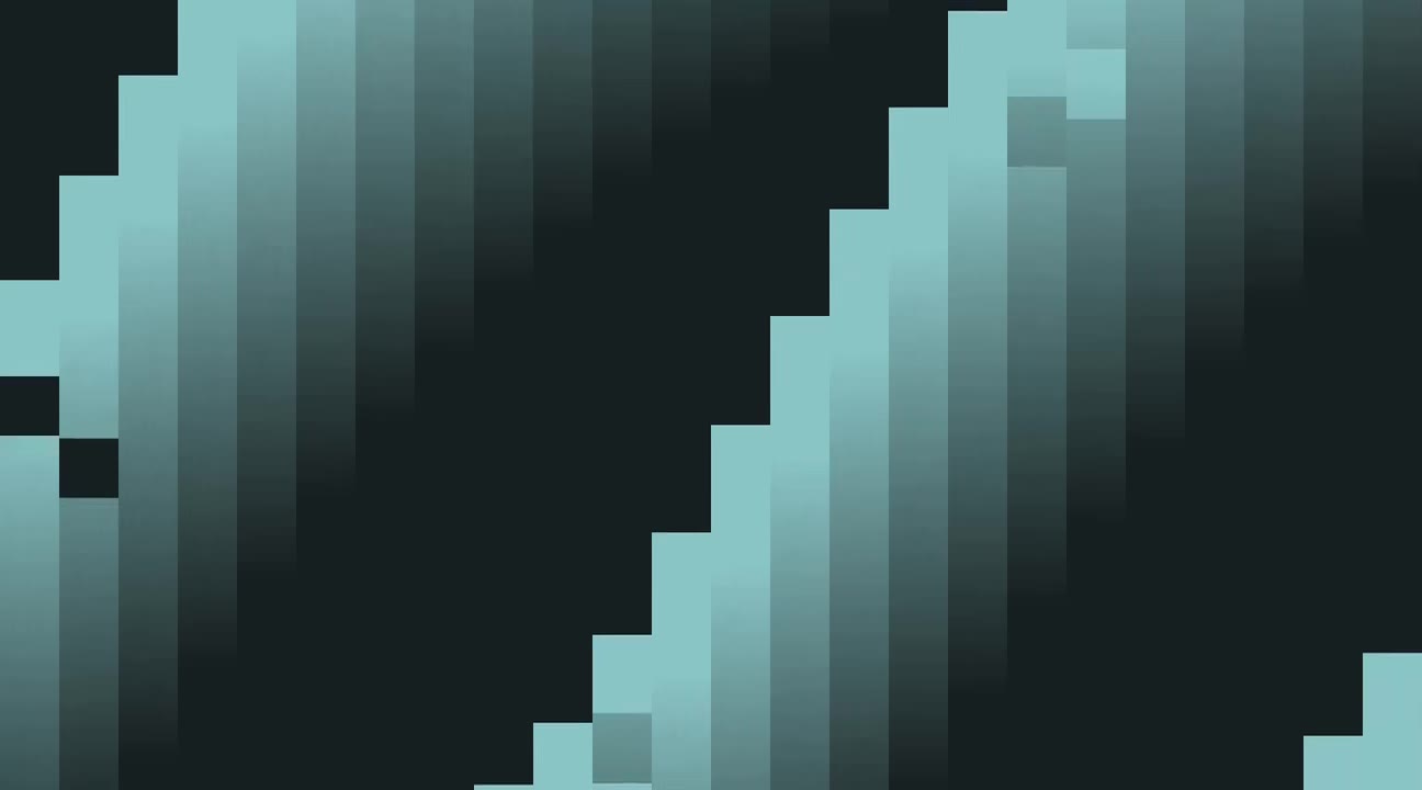
Motion. This is where we spent the most time together. We experimented with studies of how water behaves, in currents, washes and breaking waves, and translated it into multiple behaviors for a field of vertical bars that move naturally. The motion that came out of those experiments follows deliberate rules and still has moments that surprise.
AI in the process, and in the handover
AI ran through the project from start to finish.
During design, Mission Creative used it to build custom WebGL visualizers and other tools, which made it possible to experiment with forms, textures and movement that are hard to reach in conventional design software.
For the handover, we skipped the usual brand guidelines document. Hang Ten was already building its website with AI, so the system was designed for that from the first day. The desktop and mobile home page designs defined the rules for typography, color, spacing, components and interaction, and those rules were written into a plain-text design.md file, which a person can read and an AI tool can follow. We tested it by asking AI to rebuild the home page from the file alone, as a responsive, interactive prototype, and comparing the result with the original design.
Then, the full site was built with AI with human verification, feedback and iterations.
The result is a brand Hang Ten owns and can extend itself. Mission Creative will step in again, bringing its expertise to the most valuable enhancements and extensions as the brand develops. That was the aim from the start, and it is how Hang Ten itself works with its own customers: a precise specification, agents doing the work that is easy to automate, people verifying the work carefully and deciding what is right, and directing the AI to achieve outcomes that neither could hope to achieve alone.
— Sanjay and Ant